The History of Apple’s Pascal “Syntax” Poster, 1979-80
Jef Raskin said it was useful code. Steve Jobs said it was contemporary art. You decide.
Written by Lucas Wagner and Jef Raskin,
Reposted with permission from Lucas Wagner since the original page is no longer available on the Internet.
Revision 3
Foreword
Since I posted this article several years ago on Slashdot, this page has become an Internet starting point for discussing a number of 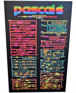 different issues, ranging from “What is your idea of the ultimate geek poster?” to discussions about the turbulent relationship between Jef Raskin and Steve Jobs, the two fathers of the Apple Macintosh computer.
One of the things that fascinates people about this project is that it is a tangible byproduct of two great minds, Steve Jobs and Jef Raskin, working together… but not necessarily seeing eye-to-eye. There are few examples of this, aside from the Macintosh, that exist today.
The late Jef Raskin kindly edited, clarified, and co-authored this with me, and for this I am grateful.
Introduction
This poster was given to me by my uncle around 1980. At the time, my uncle ran a successful print shop in Redwood City, California. The business, Westwood Press, specialized in high-end, corporate printing. They had an incredibly expensive printing press, imported from Europe, which, I believe, gave them a competitive edge in Silicon Valley, particularly when doing full color, glossy corporate artwork.
We toured his facility one summer and I remember a small stack of a few glossy posters he had taken off the press for our tour. I recognized several to be from Apple Computer, Inc. My uncle, being a generous and cool guy, allowed us to take home several pieces of corporate artwork. To this day, they remain some very interesting artifacts of Silicon Valley in the early 1980’s.

Over the years, I became quite enamored with the strange uniqueness of this poster. I didn’t know what it was or how it worked. As far as I could tell, it was a syntax chart for a programming language — Apple Pascal.
It appeared just as impressive then as it does now because of the raw amount of data contained on it. Over the years of looking at it, I had come up with some questions that I’d found somewhat perplexing.
1. Why do the colors not make sense? The top left portion is dark pink and light pink. On the other hand, the portion to the direct right of it has a variety of different colors. Was this intentional?
2. Why is it on ultra-glossy, thick paper? Most programmer documentation isn’t hung on the wall. This one could be. Is this useful artwork or a programming table? Did people hang it on the wall?
3. Is there a story behind this poster? I have seen poor quality pull-out magazine “geek” posters which have conveyed some very useful data, though I have yet to see a poster strangely similar in both quality and utility as this one. What is the story behind it?
Answers
I had to do a bit of research to find people who were around at Apple back in 1979. It amounted to sending off a variety of “Have You Seen This?” e-mails. The answer, after firing off a dozen e-mails, came from someone well known in technological circles — Jef Raskin, the father of the Macintosh.
Not only did Jef know about the syntax poster, as head of the Apple publications department, he headed up the effort to put it into production.
Raskin’s purpose for designing a new syntax chart in a poster format was utilitarian. He found that many of the existing published Pascal charts had errors when applied to Bill Atkinson’s Apple Pascal compiler. Raskin began, using Niklaus Wirth’s original “PASCAL – User Manual and Report” [Springer-Verlag,1974] as his guidebook.
He fixed the errors, though he found himself making some innovations to the chart. He made organizational changes that made the original chart more useful. As a finishing touch, he color-coded it so that a higher lexical element’s color would correspond to the syntax diagram below that explained it.
A poster format was chosen so that the programmer could glance up and have his desk free from clutter. Raskin’s original color-coding scheme made it such that the poster could be glanced at from a desk or from across the room.
Interesting idea? Well, it would be a year before Post-It notes were introduced to America, so coding clutter was likely out of control. The syntax poster was clean enough and elegant enough that it would not look obtrusive hanging on a wall in an office.
It sounds like a simple story, except for one thing. He had to clear it through Steve Jobs.
Raskin says that, when he approached Jobs to explain the concept to him, Jobs understood how the flow chart worked. However, he did not fully understand how the colors worked, even though Raskin explained it to him several times. Raskin describes him as being technically hard-headed and difficult to teach.
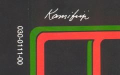
Instead of learning how Raskin’s color scheme worked, Jobs hired an artist, San Francisco’s Tom Kamifuji, who was a hot, up-and-coming artist in the late 70’s / early 80’s. Jobs gave him free reign to make it more artistic, though Jobs failed to explain that the original color scheme was important for using the chart easily.
Since Jobs did not understand Raskin’s color scheme, he had an artist alter the work, unfortunately, for the worst. Left side, rigid coloring. Right side, chaos.
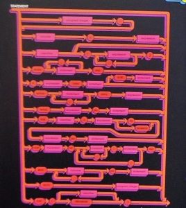
So, the results feature some strange items. For example, the “Statement” syntax block features a “pink on pink” motif.
And, whereas the Unsigned Number motif is “yellow on yellow”, the Unsigned Integer motif is “yellow on green”. Since the artist apparently did not have a tech background, the poster lost part of its utility.
Between the following scans, you can see that “identifier” is colored in FOUR different colors: PURPLE, ORANGE, GREEN, and (not shown) PINK. One could argue that they’re in different “modes” or “contexts” (Jef had famously argued against “modes”)… however, does that really help in interpreting the poster from across the room?
Jobs then ordered Raskin’s name removed as the creator of the work and placed the artist’s name in its place. I was not able to find a
reason for this, either. Was the artist was famous (e.g., bragging rights)? Was it for intimidation? Was it just artistic control? Raskin feels that this action was morally wrong.
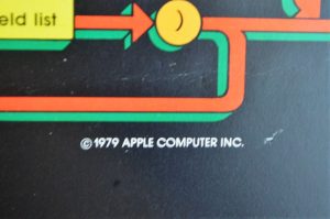
The number 030-0111-00 in the photo, beside the artist’s name, is a standard Apple document number. The 030 means it is part of the technical document series. 0111 means it is document # 111, and 00 means it is revision 0 (that is, the 1st copy). This is actually a rather low document number compared to today’s Apple documents which are in the 5000 range, I believe.
Where Was It Used?
According to Raskin, the poster ended up being over the desk of every programmer at Apple and over the desks of many programmers outside of Apple.
Andy Hertzfeld, another key early Apple employee, added that he also remembers the poster and believes they may have also been given to dealers to promote Apple Pascal. Slashdot reader and ex-Computerland employee Bruce Barrett says Hertzfeld is correct – the posters were indeed given to dealers and also given out to Apple customers.

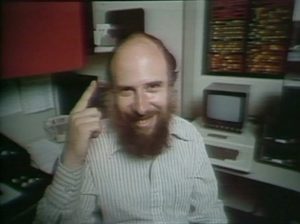


Just a quick illumination on the Apple Pascal poster. I was the product manager for Apple Pascal for it’s introduction in 1980. It was based on UCSD Pascal, developed by Ken Bowles at UCSD, and Apple negotiated a direct license from UCSD. The poster cam under my marketing purvue because it was viewed as a “dual tool”. Useful for a reference for the language by programmers, and as a great (and artistic) promotion tool to help get Apple’s name into the development community, and particularly into Higher Education, where Apple wanted to make inroads to complement its success in K-12. In fact, the reason I wound up as product manager was that I was also one of the early members (1979) of the Education Marketing group.
The notes above from Jef and Lucas are essentially correct, but need some amplification. When I took responsibility for the project, it was clear that Steve and the artist were primarily concerned with how it looked. I knew that it would be useless unless it was completely accurate. Therefore we (Apple software guys and I) spent a lot of time vetting the poster diagrams, and forcing revisions until everybody was ready to bless the accuracy. The artist pushed back a bit, because some of the changes had to me made to his original art work, and that was a real pain. Once the changes were done and blessed, it went to the printers and a run of 20,000 was done. it was sold, and also given away to colleges, schools, etc. and used by our dealers to promote the product, which was by then shipping on the Apple ][, and then released in the Summer of 1980 on the Apple ///.
BTW, a final comment. I sent several posters with John Couch (VP Software at the time), when he went to Europe in 1980 to help launch the Apple ///. He got two of them autographed by Nicholas Wirth himself, and I still have one of those. I spoke to John a few years ago at the Lisa reunion, and he doesn’t know where his signed copy is, so maybe I have the last one. It’s a great treasure and a memento of my early days at Apple.
I actually have a copy of this.
I had one way back when but it is long gone. I remember being attracted to its elegance, but confused by the colouring. Is it able to be reprinted? Can someone suggest that to Apple? I would by it (again).
That was a great article for me to read as it brought back many memories.
Beginning in 1978, my brother and I were the Computerland franchisees in Belmont and Burlingame on the SF penninsula, midway between SF and Cupertino … a great location for many reasons.
As fortune would have it, I never met Jef Raskin, the Apple Fellow that lived about 300 feet down around the canyon from my home in Brisbane, but I had his original Polymorphic S-100 bus homebuilt computer on a “consignment” table in my store for a while (nobody bought it). If I remember correctly, his wife had brought it in. It didn’t look like much could be done with it. I knew of him and that he was a close neighbor, but we never crossed paths, sorry to say.
I had met another future Apple Fellow, Bruce Tognazzini, who hosted the original Apple Core Users Group at his Village Electronics store in San Francisco, which was where I also met Andy Hertzfeld, who sold me 32 K of RAM to upgrade my Apple II (serial number 2536) to the max 48K. This was before I got my Disk II (serial number 445). That was just as I was getting my store going.
We sold a lot of Apple IIs back then, and were thrilled when Apple Pascal arrived. We also sold a lot of books and a lot of Niklaus Wirth’s Pascal book from Springer-Verlag. We held classes in the evenings for beginners and for advanced beginners, but we immediately expanded when Bill Atkinson came in and offered to teach a class in Apple Pascal. By that time we had the poster on the wall, and a lot of customers (often with me beside them) spent a lot of time staring at that colorful set of railroad tracks. Andy was correct about them giving it to us.
It wasn’t long after the IBM PC AT came on the scene that I got out of the Computerland franchise and became a tech writer in Sacramento (was I following the lead of Scot Kamins, who was also at the SF Apple Core and wrote the original Green Manuals for the Apple II (not the red one I got). The Pascal poster hung in my kitchen in Sacramento for about 13 years, while I wrote manuals and help files for a flash-flood warning company that was awarded the Computerworld/Smithsonian award for 1986, a medical software company that had problems with the SEC, HP, NEC Memories, IBM Sacramento, IBM Scotland, and Intel….then…. when I decided I’d had enough of California and went over the road as an 18-wheeler driver, I put the poster into storage along with nearly everything else. Unfortunately, the entire storage was burglarized and they took everything, including the Pascal poster (however they did leave me my fly rod and vest…. odd, eh?)